Restoration of a single-family home

This is one of those interior design projects that professionals enjoy. Why? Because this single-family house of more than 200 square meters located in Mataró, a few kilometers from Barcelona, was presented to the interior designer Eva Mesa, co-founder of the Tinda’s Project studio, as a blank canvas on which to give free rein to her work.

The owners – a young couple with a little girl – had recently acquired it, although it was a house built a long time ago, but it was not new, to tell the truth, “everything had to be done and the first thing was to remodel the distribution, since the main floor, above all, it was very compartmentalized”, explains the interior designer. Proof of this is that in the original plan, up to eight different rooms were counted, in addition to a corridor and a distributor, only on this ground floor.

The first step, then, was to remove partitions and open spaces, a hallmark that is very typical of Tinda’s Project, in addition to unifying everything for the purposes of ceilings, installations, door carpentry, floors, etc. The objective to be achieved was “a beautiful, functional project with a feeling of home”, says Eva Mesa, in response to the wishes of her clients.

DISTRIBUTION

Ground floor (124 m2)

The house is accessed through an imposing hall due to its double height, a sensation that is softened thanks to the use of the usual Tinda’s Project color palette of neutral and soft tones and the use of warm wood for the parquet, common in the whole house (except the bathrooms). It is striking, apart from a console, the main piece of furniture in the hall designed ‘ad hoc’ and integrated into the wall, right in the place where the access door to the living room was originally, which, with the reform, is relocated a few centimeters more there to focus your way to the main area of this floor.

In this same space and to access the first floor, the staircase is located, which was also completely renovated as far as the handrail is concerned, with the same lacquer as the furniture; As for the steps, they are also dressed in the same general parquet to offer visual continuity.

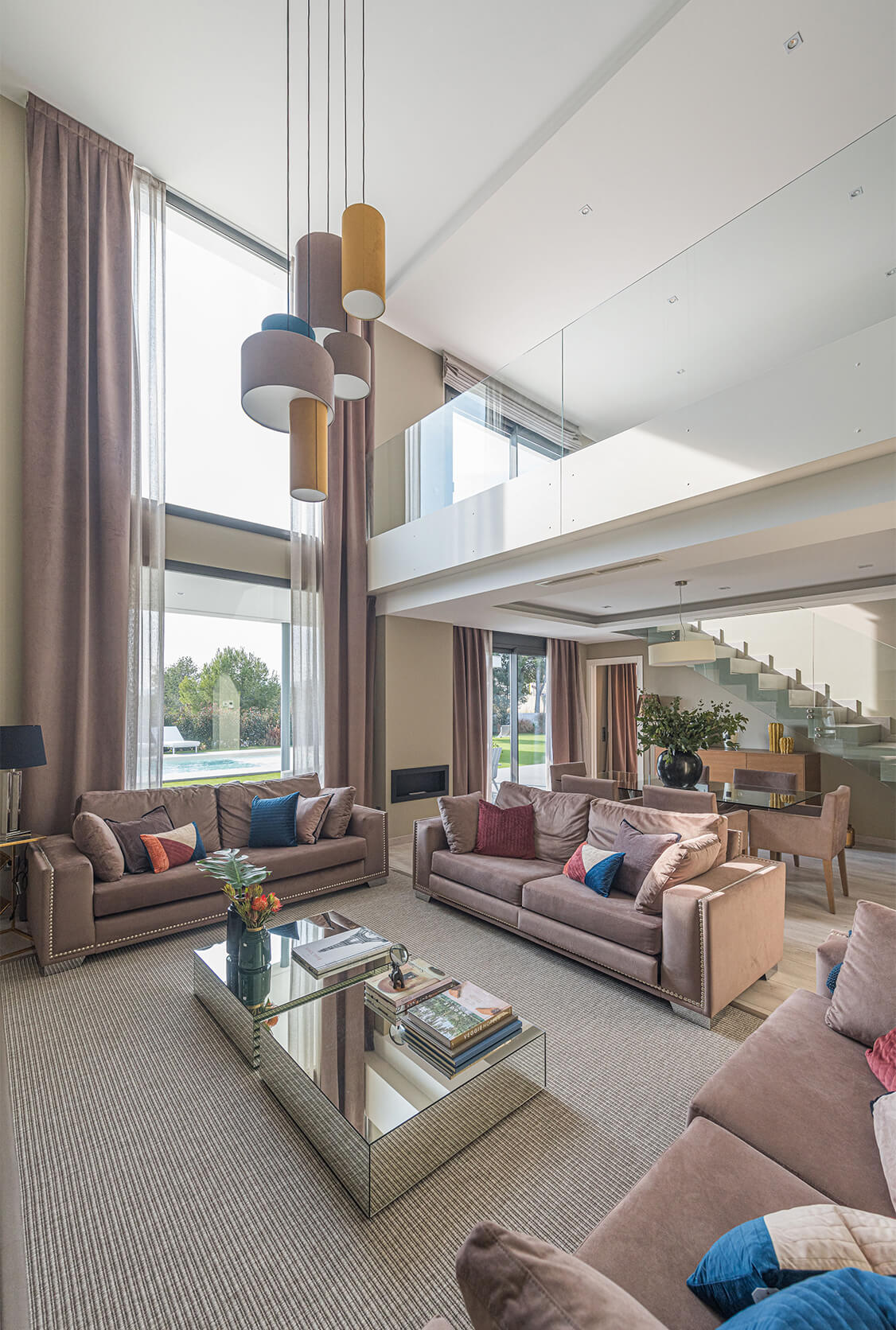
The main intervention of this project, without a doubt, is the living-dining room, which has been considerably enlarged compared to the original plan and is open to the kitchen. Proof of this are the dimensions of such important pieces made to measure as the dining table, located at the end overlooking the garden and which measures almost 2.5 meters. The same can be said of the sofas, arranged in an L shape, given that one is four meters long and the other three meters.

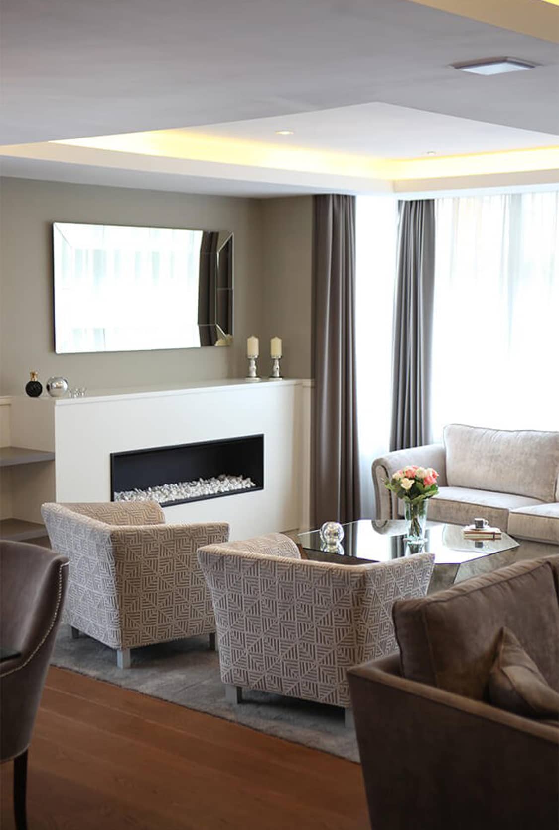
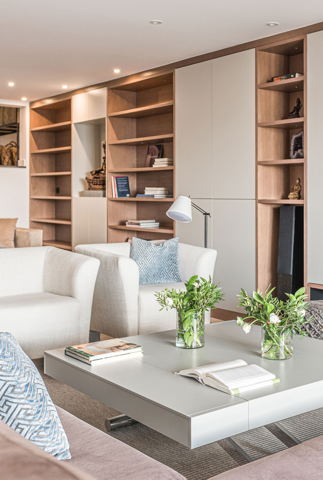
The lounge area is presided over by both sofas that look towards another key piece of furniture, also specially designed by Tinda’s Project for this space and which houses the large TV screen and, in the lower part, a hole for a future bioethanol fireplace.

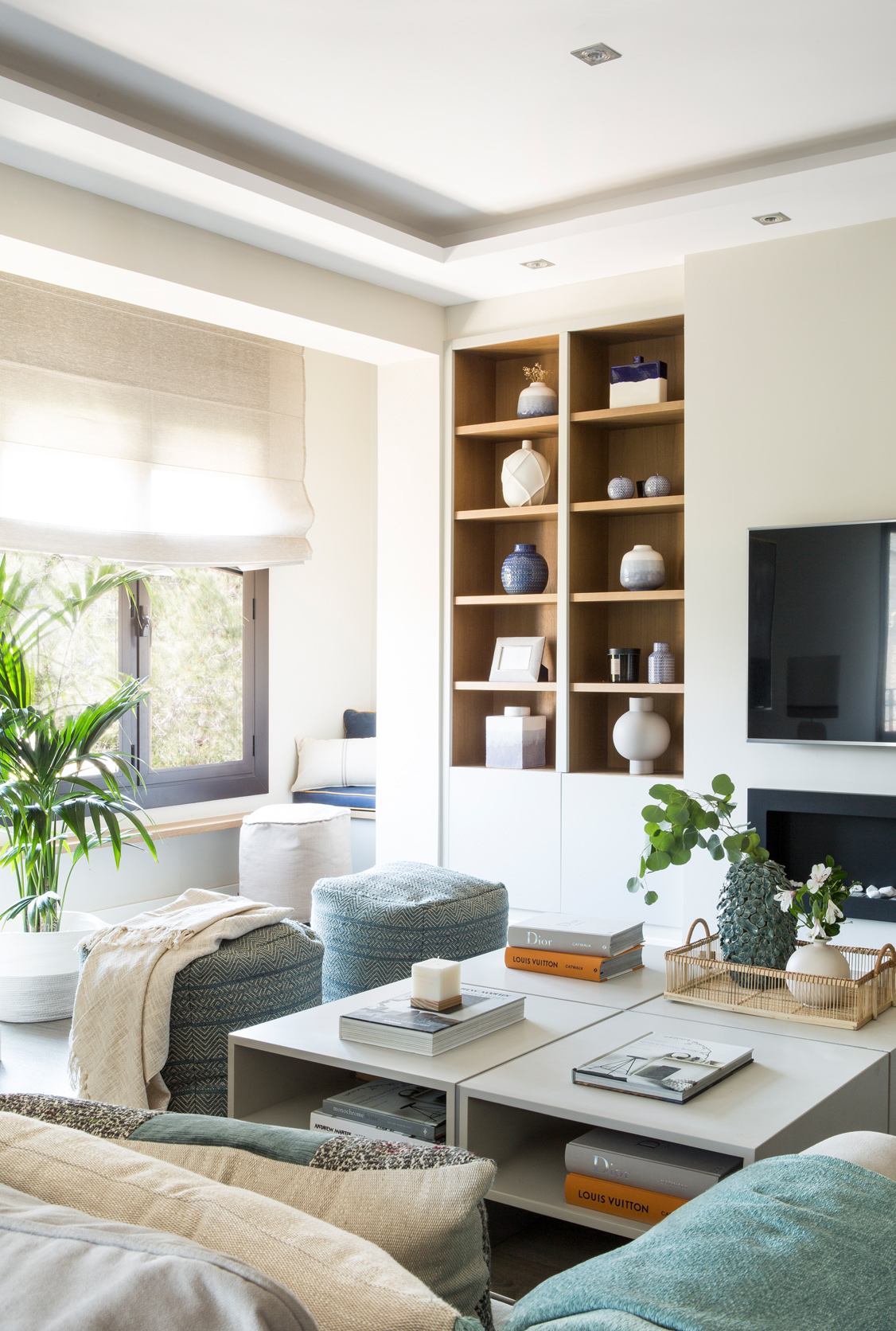
The original protruding shape of this piece of furniture has an explanation and it is that, on the other hand, it coincides with the one designed for the hall, so that they are placed on the same plane ‘back to back’. And precisely these outstanding lateral spaces have been used to include the same design of the front niches covered in wood and designed to place decorative elements or books.

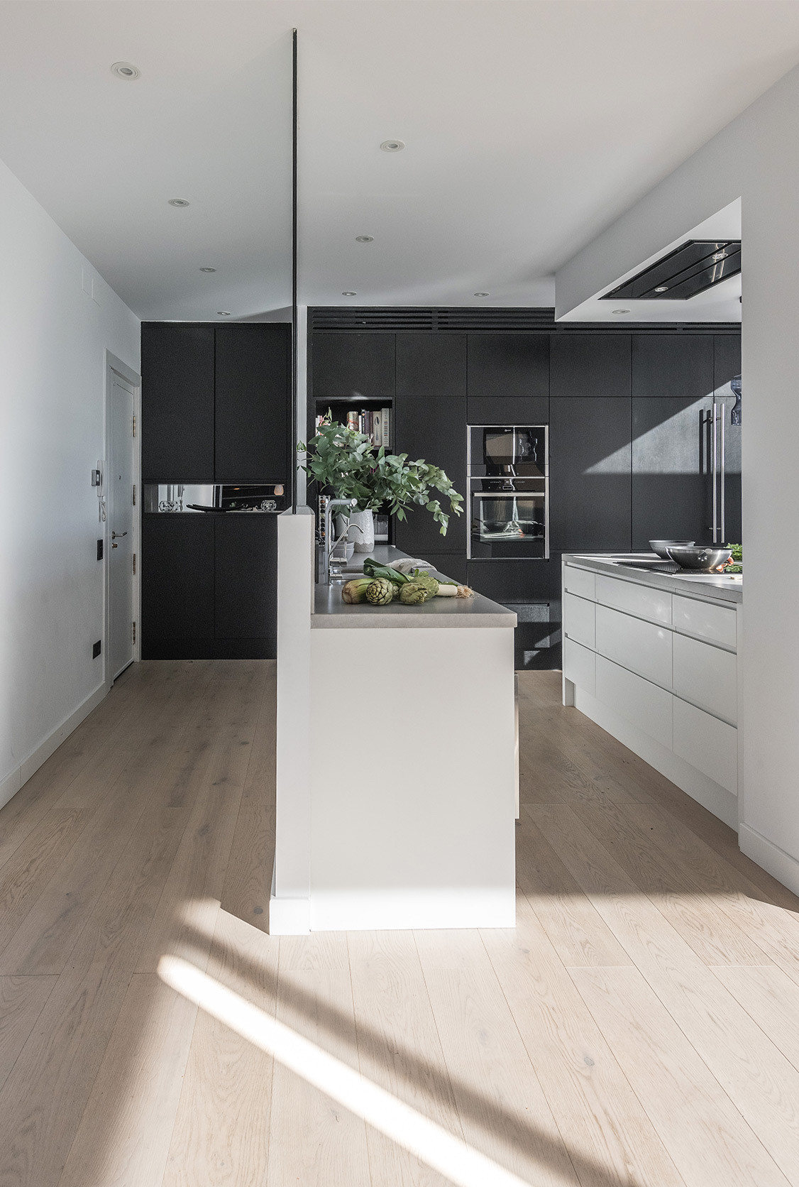
At the other end of this large open social space is the L-shaped kitchen, of which all the original furniture was kept, since it was brand new. What Tinda’s Project did do was add an island designed as a bar for more informal meals and, very close, a line of paneled furniture that hides some appliances to complement the equipment.

Next to the kitchen is the laundry area and access to the garden, as well as a guest bedroom and a courtesy toilet.

First floor (95 m2)

The first floor has been reserved for the most intimate area of the family with the suite, as well as four bedrooms and two bathrooms, one of them belonging to the suite. The objective has been to follow exactly the same premises as the ground floor in terms of aesthetics and functionality.

It is worth highlighting the suite with a terrace where the serene and neutral tones of the Tinda’s Project palette are especially appreciated to encourage a good rest. The lacquered headboard has been custom designed, including oak wood niches that serve as bedside tables.

The passage to the bathroom has been used to place two large linear cabinets with mirror fronts to visually enlarge the room, with a central detail of a decorative oak niche, winking at the headboard.

The bathroom in the suite has simple lines, again combining white, gray and wood with the idea of not altering the chromatic sense of the whole.

THE KEYS TO THE REFORM

As soon as you cross the threshold of the entrance of this house, with a quick glance at the main floor, the perfectly studied chromatic environment stands out to provide a pleasant sensation of serenity. This visual balance generates, in turn, an elegance of simple lines that invites you to stay.

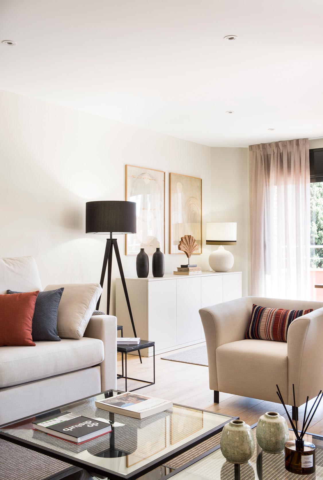
In fact, the color of the walls was made expressly for this project and it is the one that marks the line to be followed in the whole set of elements, starting with the lacquered furniture in the taupe gray tone so characteristic of Tinda’s Project. This can be seen both in the buffet next to the dining room table and in the hall console, as well as in the kitchen furniture and in the main living room, all of them made to measure by the interior design studio.

Another feature of the studio is the use of oak wood within this color scheme for its cozy and warm connotations, and it has been chosen for the dining room table, the kitchen bar top and the details in the furniture in the hall, living room and headboard of the suite.

Textiles that are so important in any project, in this one follow the chromatic trail of the whole, predominating grays in rugs, upholstery and accessories. It is worth noting the detail of the dining room chairs and the bar stools, since they are the same model, bearing in mind that it is a single environment and details like this must be taken care of especially if a good aesthetic harmony is sought.

And we can add yet another key linked to the tones of the project and they are the black touches that the owners requested, being, at the same time, a usual practice of Tinda’s Project projects. That distinctive and elegant touch that can be seen in lamps, vases and other accessories in this house, “breaks with the linear color palette that predominates but, at the same time, remains a neutral, timeless color that enriches the whole and enhances the sensations ”, says Eva Mesa.
Sober and elegant interior design

Sobriety and elegance are two of the many characteristics of this comprehensive interior design and decoration project carried out by our Tinda’s studio in the heart of Barcelona.

Noble, sober and top-quality materials are part of the interior decoration throughout the main rooms of the house, located on two floors. Each of them, designed according to the needs of its protagonists and taking into account all kinds of details so that this house is the perfect place for its owners.

On the first floor we find a spacious living room with an open kitchen designed in light tones with the aim of creating the feeling of warmth and light, making the living room the star of the space.

On the second floor, the suite room stands as one of the strengths of this house. Thanks to the integrated bathroom that includes a wonderful free-standing bathtub and a fantastic glazed sauna, we managed to create a complete space full of comforts, which goes beyond any luxury suite room in the best of hotels. Do you want to see it?

A reform of triangular floor plan proof of great ideas

This apartment of just over 100 m2 located in the Vila Olímpica area of ​​Barcelona recently had the time to undergo a comprehensive reform. Its owners, a married couple with a teenage daughter, knew that it was not going to be easy due to the triangular layout of the house. Of course, they were clear that the distribution had to be completely changed because they wanted “a larger room, more light, more storage capacity and, in general, more modern spaces“, declares Eva Tinda’s, responsible for the project and co-founder of the study of interior design Tinda’s Project.

The team started up and in just four months all the rooms were redistributed, including partitions and installations, and a complete interior design job was done to achieve the desired result. The main change was to eliminate the corridors, dispense with the hall and go from four to three bedrooms to achieve more square meters, as well as locating the kitchen next to the living room to gain practicality.

DISTRIBUTION

Social area: living room, dining room and kitchen

After the reform, the access to the house leads directly to the living room, completely eliminating the space that was dedicated to the hall. This main room, which leads to the terrace, has not changed from its original situation, although it has gained surface area and has opted for a much more functional living-dining room layout. In addition, now the rest of the rooms connect with the living room, promoting a more pleasant visual interaction and coexistence.

The main and most prominent is the kitchen, U-shaped and now also larger. Before, it was on the opposite side of the living room, having to cross the hall each time, and now it can be said that both spaces are practically one. Although each one has its own independent delimitation, the fact that they are continuous and that the sliding doors are made of glass makes them fit perfectly into a single environment, sharing the same tones and materials.

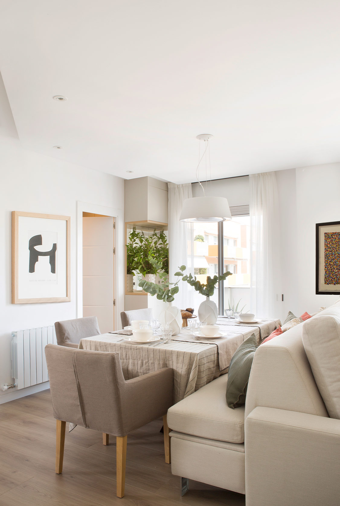
The dining room has been placed facing the kitchen to make daily service more comfortable and stands out for its original design signed by Tinda’s Project. Taking advantage of the fact that the sofa was made to measure, its back has been extended with the same finishes to create a bench that acts as a seat for the dining table. And not only that, its base is articulated to be able to open and be used to store things. The two environments -dining room and living room- share the same soft and natural tones and materials that characterize the work of the Barcelona studio, with a main piece of furniture in front of the custom-made sofa, which incorporates a bioethanol fireplace in the lower part. On the textiles, also custom-made -curtains, rugs, etc.- they are all washable and have an anti-stain treatment.

Rest area: bedrooms and bathrooms

From one end of the living room there is access to the suite, which retains its original location in what would become the narrowest corner of the triangular floor plan, but now offers a new layout. This invites you to go first through a line of made-to-measure walk-in wardrobes, with one part closed and the other open, combining the same wood finishes as the rest of the furniture in the house, including the bedside tables. Both the headboard and the armchair, which share upholstery, are also made to measure.

Opposite the wardrobe is the bathroom of the suite, with the same taupe tones of the entire interior design of the apartment, a hallmark of Tinda’s Project, including those touches of black that enhance certain elements. Walls and floor share the same travertine material, generating a very elegant envelope in which the custom-made furniture is perfectly integrated, with the same tone as the whole, but a little higher.

Following the kitchen, a door opens onto a small hallway of barely one square meter that leads to the daughter’s room and the other bathroom on the floor.

As for the youth bedroom, it is distributed on two fronts, coinciding with the entrances of light from two windows (one gained with the extension of the room). The bed has been placed on one of the fronts, under some practical shelves, all manufactured ‘ex profeso’ for this project, and framed in an aquamarine green color of the wall, the only more daring color license that has been implemented. And in front of it, the study area has been located, in line with the wardrobe, also all made to measure, to better take advantage of the angle of the wall.

For its part, this second bathroom is complete, since it is mostly used by the daughter of the family, although it is also considered the one for visitors. The aesthetic line is the same in terms of neutral and warm tones, combining wood, ceramics and steel details.

Where the kitchen was originally, an office has now been located that serves as a guest bedroom, which is reached after crossing a small corridor with cupboards on both sides. A practical closed space of just two square meters has also been created for the washing machine and dryer.

THE KEYS TO THE REFORM

Between the living room and the bedrooms and bathrooms, there was a long, dark corridor in the original apartment, the cancellation of which was one of the first decisions made by Tinda’s Project. All that dead space has been gained for the new rooms, and the most remarkable thing is what has been achieved in the kitchen.

Now located next to the living-dining room, the fact that it has sliding glass doors allows it to offer an open view of the house, from façade to façade, which also generates more light in this part of the apartment and, above all, that visual connection that was sought between both more social rooms.

In this sense of aesthetic continuity, the fact that the oak flooring is also the same also helps. It is throughout the house, except in the bathrooms.

Precisely in the bathroom that does not belong to the suite, the double step that raises the toilet and shower area is striking. This must have been generated to facilitate the passage of water intakes, since originally this space was not a bathroom. But far from being heavy, it is valued as a perfectly integrated element of distinction thanks to the continuity of the wall and floor tiles chosen in the same material.

Another interesting idea from the refurbishment is that, in response to the owners’ request for more extra storage, a space for it was created next to the entrance on the left hand side. In fact, part of the old hall and the corridor that led to the kitchen, now converted into an office and guest bedroom, were used to make the most of its sides with custom cabinets, even though it is a transit area. These follow the same design as those of the living room and the suite, with closed parts and others open with mirrors for decorative elements, combining lacquered fronts and oak wood hollows. In fact, the door that separates this passage area from the living room is made of glass, precisely to integrate both spaces, since the finish of the furniture is the same. It could almost be said that this small space is an extension of the living room.

A luxury house with pool and garden

This interior design and decoration project is the home of a family with two girls located in the residential area of ​​El Vendrell, in Tarragona. For them, it was decided that the main rooms would be distributed on one floor based on a modern style architectural structure marked by straight and simple lines.

The aesthetics in the form of different cubes are highlighted by the Mediterranean white prevailing on the façade. The spaces are spacious and bright in this single-family house projected and designed entirely to measure. And in which, in addition to white to enhance that effect, gray has been chosen, both in the exterior porch and decking areas, as well as indoors. An essential color palette in all the work we do in the studio.

The house has a garden with a luxurious pool, in which the outdoor furniture looks perfect next to the vegetation projected by our landscapers. Thus, the three disciplines of Tinda’s: interior design, decoration and landscaping are fused with the greatest possible care, achieving the maximum enjoyment of their owners … and that is the most important thing for us.

Who doesn’t want a luxury house with a pool and garden like this? We do.

Interior architecture

This is a project that has required the work of architects, interior designers and decorators working in unison. In this duplex penthouse with three terraces, we have carried out the design and execution of furniture and landscaping.

The interior architecture is sober and minimalist, making light and straight lines the bases of this reform. For this, the interior architects have designed on the ground floor a kitchen open to the living room, connecting both spaces to the outside to enjoy the views of the city.

In the kitchen, we highlight the large columns that follow the same architecture to the outside, delimiting the area. Meanwhile, a large piece of furniture designed by our interior design studio and made to measure is the protagonist of this spacious room.

A highlight of this penthouse as an example of interior architecture are the stairs, a unique and key piece that, in turn, is part of the decoration.

Designed as an ideal home for this family, the children’s area was installed on the top floor as a separate area, with its terrace, its games room, study and rest area.

In the area for the couple we have separate dressing rooms for each one, with a spacious bathroom connected to the double room; in addition to projecting a guest room with all the comforts.

Interior design and decoration at home

The interior design and decoration of this house is based on a neutral style, both in forms, materials and colors. Our client’s request was to carry out a housing project that could be adapted to the taste of all types of tenants, since it was initially intended as a rental property and, in the future, would become the home of the owners when they moved to live in Barcelona.

We had the advantage of knowing well the style both in interior design and decoration of our clients, since this was the second project we carried out for them. For this reason, for the interior design of this house we use an open distribution in the living room area and an American kitchen with an island attached to the living area, but with the possibility of separating in the future with a glazed wall if desired. In this area, we also had a dining area with a bookcase adjoining the sofa area. The three zones are united but at the same time visually differentiated by the troughs and framed ceilings that delimit them.

In the decoration of the house, the same colors have been combined both in the kitchen furniture and in the living room and bookstore to give it a unified and continuous appearance.

A living room open to the kitchen and much more…

This family duplex is designed at all times for its inhabitants, and it is that this family with three children was looking for a practical and cozy home, without having to give up design and modernity in interior decoration.

The basis of this interior design project, key for our team of architects and interior designers, is the creation of an open and bright home. Thanks to this, the light passes from one side to the other of this home, giving a feeling of life throughout it.

Without a doubt, what we highlight about this comprehensive reform is the unification of spaces. A spacious living room open to the kitchen welcomes us to the apartment; in which the kitchen joins the living room and dining room on the other side of the room. A comfortable bar makes daily life with children easier in the middle of the open kitchen.

The design staircase leads us to the children’s area: the 3 rooms decorated with great care by its owner, a real handyman, following the wishes of our little protagonists. Two full bathrooms, one with a shower and the other with a bathtub, complement this area.

Finally, the suite with open bathroom is located on the upper floor next to a comfortable work space, maintaining the ideal intimacy for the couple.

Elegant style by the sea

This house of 300 m2 located in the channels of Ampuria Brava, in the region of Alto Ampurdán, is the result of a comprehensive makeover which has been carried out seeking its maximum enjoyment all year round with the different spaces according to each season.

This elegant style house has been thought to have all the comforts of its owners. The sober and timeless decoration with a touch of Mediterranean style surrounds every corner.

To do this, spaces have been unified by zones and floors. At street level we find a large kitchen that welcomes us and leads us directly to a sunny living room with views and access to the port. On the first floor, we find directly the bedroom connected to the dressing room and bathroom, all open to take advantage of the natural light that enters from both sides of the property. Finally, from the main floor we access the lower floor, where a large office with a big reading area allows us to enjoy this quality and comfortable stay.

At Tinda’s, we have designed each piece of integrated furniture designed so that all the elements are completely hidden from view and we do not lose the sense of order and well-being. Will you join us to see it?

Elegant and sober style with Mediterranean touches.

Renovation of a house in the Empordà

Among some of the havoc that the current pandemic has caused in the construction sector, the problem of having left many works halfway stands out. In the case of this house, the entire interior design part was pending, a problem that the owners resolved by calling Tinda’s Project. “We don’t know what style to give it,” the owners told Eva Mesa, founder of the studio. “Our job consisted of choosing colors and finishes, providing it with the furniture it lacked, decorating it and dressing it,” explains the interior designer.

The location of this second residence of a family with two small children and most of the construction elements already implemented marked the line to follow in the work of Tinda’s Project. Although it is located in the small municipality of Vulpellac (Girona), whose old medieval center was declared a ‘Cultural Asset of National Interest’ (BCIN) in 2004, the house is a newly built renovated townhouse that includes characteristic features of the typical constructions of the Empordà area such as the original Catalan tuff floors, the typical Bisbal tiles and details of the Catalan vault, among others.

Mediterranean style in the countryside

With this cover letter, Tinda’s Project was very clear from the outset about the style that would define the home, following the wishes of the owners who wanted, above all, to “feel at home”. “It is clear that the Empordà style is reflected in the house“, comments Eva Mesa, “but they also asked me for a Mediterranean style but one that would not derive in connotations of the sea, but of the countryside, although without being too rustic“.

The first step carried out in the ‘content’ was to change the color of the walls and to enhance that natural effect that the whole house gives off, a lime treatment was implemented, with a very subtle aged finish. The result is textured walls in an off-white tone that act as a canvas on which all the necessary elements were implemented to make up this home from the same decorative thread that runs through all the floors and is based on the tones clear dotted with serene brushstrokes of color that do not alter the ambient comfort.

DISTRIBUTION BY PLANTS

Low level

Access to the house, at street level, takes place on this floor made up of the garage, a play area and a small hall from which the staircase that supports the house starts.

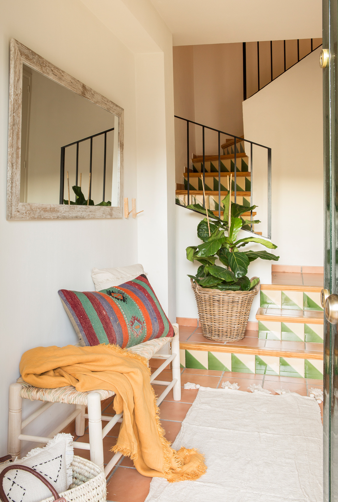
At this point, two of the construction elements linked to the territory are obvious: the traditional tuff floor and the two-tone rustic tiles on the front of the steps. Taking them into account, Tinda’s Project chooses a bench made of natural wood and braided cattail as the main furniture and combines it with a mirror with an aged wood frame and some raffia baskets as accessories. This letter of introduction that receives the visitor already determines the decorative style that will be found in the rest of the house.

First floor

The distribution, which is the original one, was not altered and on the first floor two rooms are clearly established -living room and kitchen with office-, in a single open space, since there are no doors and it is the landing between floors of the staircase. the one that makes environmental separation. The two walls that it has on each side play with different openings to enhance a dynamic visual shot between both rooms.

Although this floor is shown open, we managed to create a welcoming air in each one, where the feeling is one of recollection,” says Eva Mesa. For this, pieces of furniture and accessories were sought that invite you to stay and enjoy each room.

In the living room, a sofa with chaise longue was used as it was placed next to the fireplace and in front of some simple wooden shelves flown to place decorative elements in order not to overload the wall.

As for the kitchen, it is distributed, on the one hand, with custom-made L-shaped furniture in a successful light tone that enhances luminosity and, on the other, the office area that Tinda’s Project created from a large table made of wood that combines different seats. The main one is a bench made to measure from end to end that invites those long and pleasant after-meals that the owners enjoy every time they come with friends or family. This comfort is achieved with the selection of natural materials and finishes for textiles, lamps and chairs.

A small courtesy toilet, located in front of the stairs, complements the use of this first floor.

Second floor

This floor is reserved for the rest area with three bedrooms and two bathrooms.

The main suite with integrated bathroom complies with the aesthetic line of the rest of the house, that is, a predominance of light tones with some touches of color in the textiles and the incursion of natural materials, such as the raffia of the suspended night lamps, the linen for the curtains, and the wood and wicker benches located at the foot of the bed, next to the natural fiber rug. Even for the wardrobe, the doors have been replaced by burlap or sackcloth curtains, with the idea of ​​following this same common thread.

The children’s bedroom is shared by the two children and the bed was designed to measure and aligned to the wall, which is actually the sum of two joined by an invisible headboard, so that during the day it becomes a large and comfortable seat for play. But the piece still hides another advantage and it is the third bed that it has hidden in the lower part for when a little friend is invited home, as well as a chest of drawers.

This floor includes a third guest bedroom and a full bath.

INTERIOR DESIGN KEYS

Although it is a construction element that was already originally in the house, Tinda’s Project wanted to take advantage of the traditional connotations of the Catalan tuff floor that runs through all the floors to implement that typical Empordà style. How? Enhancing the sensations of country houses through the use of natural materials and very light and serene tones, without falling into the rustic, and which, in addition, project that atmosphere of relaxation and well-being that the family seeks when it settles here, far away from the bustle of the city.

Natural light also plays an important role in this idea and the luck is that the whole house enjoys it, since it has windows and French doors at both ends, which facilitates light throughout the day. Tinda’s Project uses vaporous linen and cotton curtains in an off-white to filter said light without detracting from it.

Because the views of the garden or the natural surroundings of the town are part of the charm of the house and, as a wink, all the carpentry and their respective traditional external roller shutters were chosen in green, the only color license that is more risqué than stands out in the whole and that is more than justified. In addition, it is combined with the use of tiles of the same tone, both in the courtesy toilet and on the steps of the stairs, and also in the presence of natural plants in various corners of the house.

Also noteworthy is the use of natural fiber rugs in all rooms, either to delimit spaces or to provide warmth and comfort and cover that original flooring that adds so much value to interior design.

In general, the sum of all these elements that Tinda’s Project has worked on in the project, makes the house represent a true haven of peace, thereby fulfilling all the wishes requested by the owners.

A complete renovation tailor-made for a new life

There are interior design projects that enhance the value of personalization right from the front door, and this is one of them. It is part of the magic of an integral reform, the ability to create a customized home, in this case, for a homeowner who is starting a new stage in her life. 

The interior design studio Tinda’s Project knows a lot about listening to what the client needs and feels. “It is a process that accompanies the evolution of the work, in a close atmosphere, with the idea of bringing out the best in the person to capture it in their home”, explains Eva Mesa, interior designer and co-founder of the studio. 

The almost 200 square meters of this penthouse in the upper area of Barcelona were completely refurbished with a new layout that responds to the desires for “plenty of light and very large and open spaces for sharing, based on very timeless lines”. 

DISTRIBUTION

The house, with a rectangular floor plan, complies with the highly recommended layout of separating the two main areas from a central entrance. In this case, the rest area is located to the right of the entrance hall, coinciding with the rear façade and, therefore, the quieter area, and the social area is accessed to the left of the entrance and overlooks the street.

In this refurbishment the aim was to maintain the role of the entrance hall as such, that is to say, as a welcoming space and at the same time the backbone of the rest of the rooms. As soon as you enter, you can already perceive the neutral base of materials and shades that will act as a guiding thread throughout the project, highlighting the luminosity it receives thanks to the fact that the passage to the large living room with a terrace has no doors. The parquet flooring chosen for the entire flat in a very light tone also helps. 

The armchair in the entrance hall is the studio’s design, custom-made, and the main piece of furniture has been designed and manufactured ‘ex profeso’ for the project, all in a very modern line that includes the two lamps, and where the carpet is also custom-made.

SOCIAL AREA

The three rooms that make up this area – living room, dining room, and kitchen – total almost 60 square meters and have been visually designed as a single open space. It could be said that each room, in turn, is clearly defined by a particular element. The living room is delimited from the dining room by a structural pillar that has been clad in a mirror to integrate its presence more intimately, while the reflection on all four sides offers a play of planes that enhances the luminosity. The kitchen is delimited by a large glass door, a very good option for those seeking physical separation but at the same time a visual connection. 

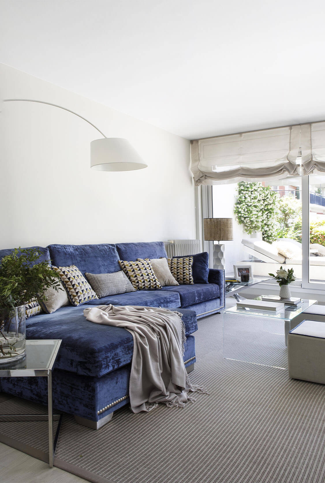
In the living-dining room, the blue tone that the owner requested stands out especially, “for its Mediterranean connotations that she likes so much”, standing out above the predominantly neutral palette. Tinda’s Project focused on a custom-made sofa with chaise-longue upholstered in an elegant velvet whose fabric offers a successful play of waters, the same material that dresses the dining room chairs. 

The detail of the colour blue is also found in some decorative accessories, as well as in the edging of the poufs next to the coffee table and in the totem-type dining room unit, designed by the studio, which for this project has incorporated wood in a blue finish combined with the lacquered white and the mirror at the back of the unit that visually expands the space.

The location of the television has been resolved with an Italian-designed piece of furniture between the two large balcony doors, creating the visual effect of having the monitor suspended. In this way, it can be viewed from the sofa as well as from the dining room and even the kitchen.

The kitchen, which can also be accessed through a door next to the entrance hall, has been laid out in an L-shape with custom-made furniture in a range of whites that combine perfectly with the light parquet flooring and the Silestone worktop with a marble finish. The ensemble creates a very luminous ambience enhanced by the direct light from the terrace.

The considerable dimensions of the kitchen have also made it possible to have an island in the central area designed with a double function: a cooking area and an informal dining table. And parallel to it, in the ceiling, an inverted pit has been installed to conceal the extractor hood, creating an original play of heights. From the kitchen, there is direct access to the gallery that houses the laundry area.

The terrace, measuring over 30 meters square, has been divided into two ambiences -a dining room for six people and a relaxation area featuring two deckchairs- under the complicated open structure of the building that made it necessary to play with different awning solutions to protect it from sunny and rainy days. For the floor, a specific outdoor decking was chosen and the entire outermost perimeter has been fitted with planters containing different species of plants that offer a certain degree of intimacy. The project for this leafy and pleasant urban landscaping is the work of Manuel Maíllo, co-founder of the studio, together with Eva Mesa. 

REST AREA

To the right of the entrance hall is a corridor that leads to two bedrooms and a bathroom, which is also used as a guest toilet. Once again, neutral and elegant tones have been chosen, highlighting the texture of the wall cladding, as well as the worktop, which had to be made to measure due to the size of the bathroom. Its continuous design narrows from side to side to provide a point of support for decorative accessories, etc., reserving a wider part for the base of the washbasin, a shape that was duplicated at the bottom for the towels.

The other striking space in this project, next to the living room, is the suite: “We were looking for something out of the ordinary”, explains the interior designer, and they found it in the geometric shapes and black touches. In keeping with the timeless tone of an overall neutral base, the license to combine black with white in the owner’s bedroom enhances the classically elegant effect. Thus, striking black lines frame the headboard, vanity unit, and dresser, all custom-made from lacquered wood.

The striking geometric design of the velvety upholstery of the headboard and the pouf-shoe rack is continued in the bathroom cladding, also in black and white. “A union between the two spaces is sought through geometry which, in turn, generates a very sophisticated visual dynamism”, describes Eva Mesa. 

The half-height wall in the bidet and washbasin area -which conceals the latter’s cistern- has also been clad in geometry, leaving the upper part to frame an apt phrase in the manner of a personal mantra. 

Although situated on the opposite side of the house and owing to the height of the attic, the suite also boasts great luminosity thanks to the two large windows it has, the result of the union of two old rooms. To allow this natural light to filter into the bathroom, a light and very discreet frosted glass door were chosen.

Details such as the ceiling coving that frames the bedroom space and the dressing room with hanging lamps, as well as the made-to-measure furniture that hides the radiator, are details that further enhance the distinction of this suite that is personalised for the owner of this flat.

Warm and cozy integral reform in Sarrià

Separating atmospheres and transmitting calm and elegance were the bases of this interior design and decoration project, located in the Sarrià district of Barcelona. 

The complete refurbishment of this 200 m2 flat was designed with a new redistribution in mind and, above all, to define the spaces to create a harmonious whole between the different rooms, also in terms of dimensions. 

The main objective was to separate rooms in which each inhabitant had their own private and intimate space but, at the same time, to be able to enjoy large common rooms where they could share moments with the family“, says the Barcelona interior designer Eva Mesa, who directed the work on this flat, anticipating each experience, each use and each sensation required by the different new spaces. 

High-quality materials, luxury finishes, and warm details were used to decorate the interiors, resulting in a comfortable and special project, characterized by the peace of mind that comes from knowing that you are in the home you wanted so much. 

A serene and functional interior design for a Barcelona penthouse apartment

When the homeowners bought this penthouse with two terraces localized in Barcelona, they were already aware that it required a complete renovation, focusing on interior design and decoration intervention in Barcelona, as everything was very outdated. Regarding the layout, Tinda’s Project studio made hardly any changes, as it suited the needs of the couple and their teenage daughter quite well, except for a couple of partitions that had to be moved to make the bathrooms a little bigger.  

The new owners’ requests focused on having open and spacious rooms, correspondingly storage space, which was achieved thanks to the bespoke cupboards in the hallway. This L-shaped corridor is the one that articulates the entire floor of the flat, whose surface area totals 123 square meters, including terraces. 

The other advantage of the flat is its corner position, which means that all the rooms, excluding the small office located next to the lobby and the two bathrooms that face the interior of the building, boast plenty of light and views of the street as well. 

DISTRIBUTION

ENTRANCE

The entrance hall, with simple lines, has two wardrobes on either side of a console, all custom designed by Tinda’s Project and with the taupe grey finish that characterizes the chromatic palette of all its projects. The horizontal striped wallpaper has also been chosen in the same tones. 

KITCHEN

From the entrance to the flat, the first section of the corridor leads directly to the kitchen, one of the best-used rooms. Its rectangular floor plan allows for two differentiated areas. On the one hand, the U-shaped work area in the inner part and whose furniture has been updated with new doors and handles, maintains the classic black granite worktop, matching the existing porcelain floor that also frames this area.  

In the most external part, with direct access to one of the terraces, the office has been located next to a piece of furniture that runs along the wall, designed by the studio with the same finishes as the rest of the kitchen. In addition to some integrated electrical appliances, it includes laundry equipment and, in addition, a more decorative and service part for the table. The existence of a master pillar that caused a very narrow backdrop is used to accommodate the television. 

LIVING ROOM

The second section of the corridor leads to the living room, which has an original and barely perceptible oblique shape concerning the general floor plan. It also has an open mini anteroom that is used as a reading corner. Next to the wing chair and the plasterboard shelving is a book-style table leaning against the wall designed by the studio that, for special occasions, opens and can seat up to 12 people. When closed, it is presented as a console that serves as a support for some decorative elements. 

The bigger space is the living room, presided over by a custom-made sofa with chaise longue and upholstered in the same range of colours as the rest of the house, as can also be seen in the curtains and the carpet. Next to the sofa, Tinda’s Project has designed the bookcase with open and closed spaces that bring visual dynamism to the environment. 

TERRACE

The living room leads out onto the terrace designed by Tinda’s Project’s landscaping department. To add a special outdoor decking, the entire perimeter has also been decorated with a wooden design that alternates planters and benches, leaving the central part free to place some side tables. A pair of wooden lattices also provide a certain intimacy to the space. 

MASTER BEDROOM

Just in front of the reading corner is the access to the master bedroom, which boasts a lot of light, as it has two windows, one of which connects to the terrace. All the furniture has been made to measure: the desk overlooking the terrace with the armchair, the pouf-type bench for shoes, and the wooden and lacquer headboard with integrated bedside tables and lamps. Once again, the taupe grey tone provides a unique ambient environment, including the made-to-measure curtains, and is only altered by some touches of colour proposed for the bed textiles, highlighting the photograph that presides over the bedroom. 

MASTER BATHROOM

Both the floor and the wall covering in the shower area is a dark-colored imitation marble porcelain tile, matching the mirror frame and the washbasin taps. The wall-mounted washbasin unit is a design by Tinda’s Project with a drawer unit in a mouse grey finish and the worktop in white colour. 

COURTESY BATHROOM

The courtesy bathroom has been tiled in white porcelain imitating marble that plays with different sizes and finishes because the front of the washbasin has been chosen in the meter type, whereas the shower is smooth.  

The black lacquered custom-made unit with gold handles stands out for its contrast, situated in a line that extends from the washbasin to the toilet, integrating the tank, which is not visible. 

Luxury interior design in the exclusive Paseo de Gracia

We are especially excited to tell you about this spectacular comprehensive renovation project, which we are carrying out on one of the most emblematic streets in the city of Barcelona; designed as a holiday home for its owners and with the additional use of rent when they do not enjoy it. With luxurious finishes and interiors, this interior design and decoration project is designed so that its guests not only enjoy the city, but also have an ideal and exclusive stay.

This project highlights the fact that it adapts to the number of people who can stay in the home, as we have two independent homes in one. With a capacity for ten people, we fulfill our client’s dream of having a luxurious interior decoration, without losing the references to Barcelona’s modernism and Catalan design.

Thus, the main idea was to preserve the Catalan architecture of the house, between modernist and gothic, but giving our style with a particular and exclusive touch. We hope you like it…

Mediterranean style interior design

This bright house in the purest Mediterranean style is located in one of the best known towns on the Costa Brava. The Mediterranean decoration immerses us in a vacation state full of harmony.

This two-storey house stands out for its comfort and functionality at the distribution level. In the daytime area, we find a spacious dining room with access to the terrace, where we have designed the exterior as a whole so that its inhabitants enjoy direct access to the port.

Wood and wicker furniture; textiles in blue and white tones and decoration accessories are the key to this fresh and summer look, so typical of the so-called Mediterranean style. The unique decorative pieces, in many cases artisans, some of them by ceramists and artisans from the area, are what give the house that unmistakable style that only reflects the light of the ocean.

A “slow-burning” integral reform

The project of this house has been done ‘over a slow fire’ which means, the interventions have been carried out in parts in the different rooms until the result of the integral reform that the interior design studio Tinda’s Project can show in its entirety.

This 140-square-meter flat located in the city of Barcelona belongs to a married couple with grown-up children who no longer live at home, a stage that the owners have taken advantage of to give a new image to the family home, not only to update it but also to adapt it to other needs. The proof is that the intervention of the studio led by Eva Mesa has involved both building works, including the change of old installations, and interior design and decoration. 

In search of maximum luminosity 

One of the main conditioning factors of the flat is its location on the ground floor of the building, which means that less natural light enters and, therefore, it was necessary to think of the best resources to maximize it.  

The first step was to lighten the original parquet. It was restored throughout the house, thus reducing the intensity of the oak wood. The next decision taken by Tinda’s Project was to resort to a chromatic palette based on white (including the woodwork of the doors) and natural wood, far from the usual grey tones of their projects which, on this occasion, would not have helped in the search for more luminous spaces.  

That has been perfectly achieved both in the living-dining room and, in the suite, the two rooms that have a direct entry of light from the outside through large windows. 

DISTRIBUTION

One of the rooms that have been notably improved is the entrance hall. On the one hand, aesthetically, it has been completely refurbished and equipped with the minimum furniture, a console table with a fine structure and a few decorative accessories. On the other hand, because of the brightness. It used to be dark but now with white walls and lighter floor, it looks different, highlighting the recommendable idea of the access door to the living room (on the right-hand side and sliding) with a glass part, which allows natural light to pass through. 

The living room and dining room share the same space and it is the most comprehensive intervention that Tinda’s Project has done in the flat, with everything completely new, except for the paintings that are the work of the owner and, although in pastel tones, provide the most striking touch to a predominantly serene and relaxing atmosphere of white and ecru colours.

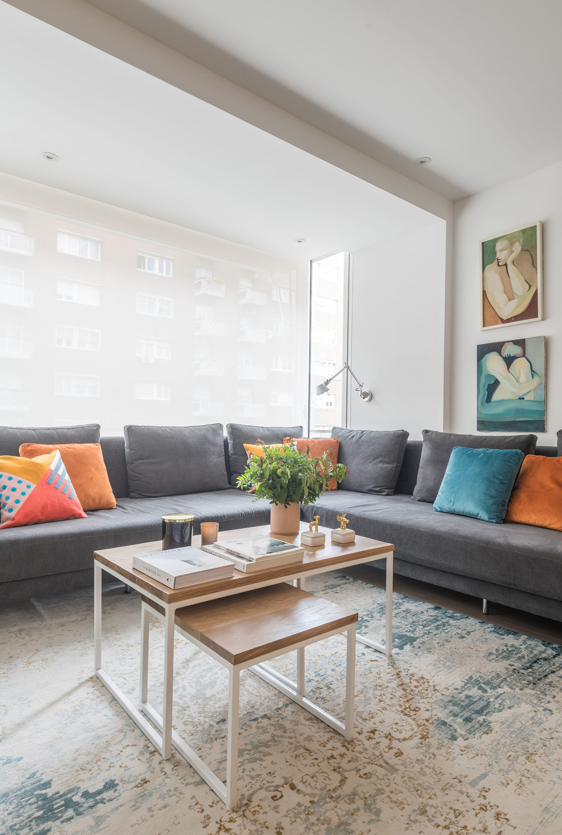
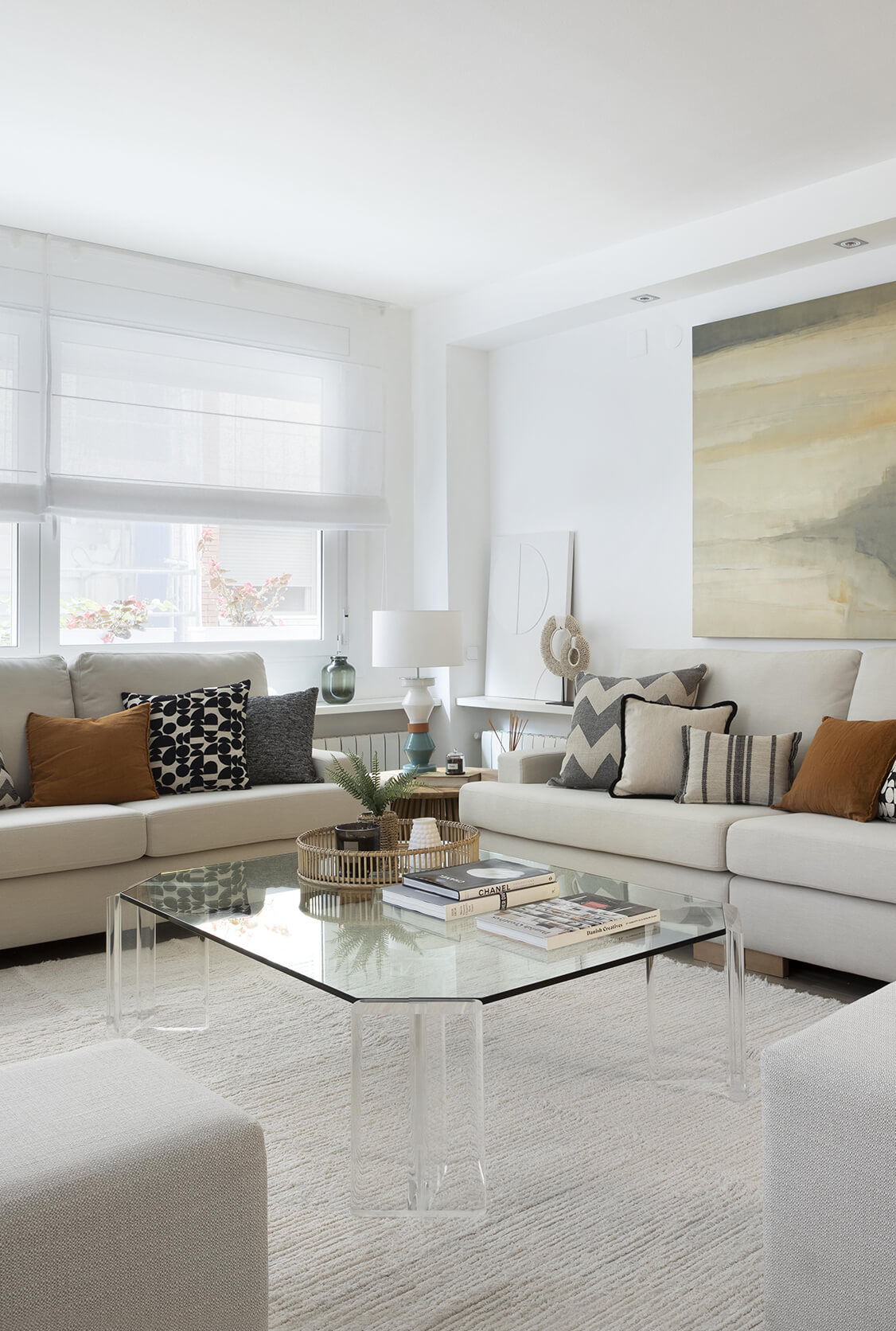
In the living room, two L-shaped sofas make up the most comfortable part, around a glass coffee table that further increases the feeling of lightness and spaciousness. The upholstery of the sofas, the blinds, and the poufs have been made by Tinda’s Project, in very light colours, like the carpet. 

Special mention should be made of the television cabinet, made to measure by the studio, also in white and designed as a separating element concerning the dining room, although in a discreet lateral location that does not interfere with the passageway. On the main wall, there is a piece of furniture whose design is very much in keeping with Tinda’s Project. Shaped like a capital ‘i’, it runs from floor to ceiling in white lacquer, all closed off for storage except for symmetrical decorative recesses in wood and glass.

The dining room for six diners has simple lines and the armchairs have been upholstered by the studio, as have the curtains. It is situated next to the other door that connects this space with the corridor and the other rooms in the flat, favouring a more direct flow, especially with the kitchen. 

The kitchen was one of the first interventions carried out in the dwelling. It was reformed based on a more modern line, all in white, and combining it with the metal of the extractor hood, the handles, and some electrical appliances, and introducing some glass furniture. 

The bathroom in the suite is very similar, with which the kitchen shares the large white ceramic flooring. The fact that there is no natural light conditioned the choice of an off-white wall tiling, as well as the white washbasin unit. The worktop extends the piece above the toilet to create a decorative shelf and another overhanging shelf has been placed in the lower part of the washbasin to keep the most essential items close at hand. The large horizontal mirror with an original braided frame in a metallic finish enhances the effect of enlarging this room. 

As for the master bedroom, a handleless white made-to-measure wardrobe runs along the wall at the foot of the bed in a gentle curve. The same wood is chosen for the two simple shelves that act as bedside tables on either side of the bed, without any further artifice, to leave the whole lower part uncluttered and gain in visual amplitude. Delicate linen blinds filter the entry of natural light and, like the carpet and bed linen, have also been chosen in white. The only chromatic license allowed that alters the harmony of the bedroom is the dark walnut furniture, an heirloom piece from the owner. 

The essence of Barcelona’s Eixample with modern interior design

The German couple who bought this flat in Barcelona for their trips to the city were not only looking for a central location, but also a home with a certain reminiscence of local architecture. The combination of both premises was limited to the emblematic Eixample district, where they finally found it.  

It is a building with a completely refurbished historic front whose dwellings are newly built, so the intervention of Tinda’s Project studio focused on the furniture, decoration, and final attrezzo. The 136-square-meter flat follows the traditional narrow and elongated floor plan with an external exit at both extrems; one of them to the street Muntaner and the other to the typical interior courtyard of the block. The usual compartmentalized surface of these dwellings has been kept quite faithful except in the more social area, which presents a generous opening of spaces to enhance precisely this use. The result is two double bedrooms, a complete bathroom, a suite with a bathroom, a small study, the laundry room, the kitchen, the living-dining room, and the terrace.  

The lack of a certain amount of natural light in some rooms of the flat led to the choice of a very light general chromatic palette of white walls and oak parquet, which combine perfectly with the usual finish of the studio, in a mouse grey tone, implemented in practically all the made-to-measure furniture, dotted with a few touches of black. 

DISTRIBUTION

The entrance is right in the center of the flat, which facilitates a perfect distribution between the day and night areas, on either side of the entrance hall. This, as is usual in this type of old flat, boasts generous dimensions and a large window.  

The highlight of the entrance hall is the detail of the original hydraulic floor in the form of a carpet, a clear allusion to the type of flooring used in these stately homes. It is perfectly integrated into the oak parquet and its patterned aesthetic is enhanced by the bespoke smooth finish lacquered dm furniture that Tinda’s Project manufactured ‘ex profeso’ for this space, based on the studio’s design in mouse grey combined with the detail of the integrated niche in oak wood and mirror. 

Day area

In this home, the day area was in the interior part, the quietest and with direct access to the terrace. So, to the right of the entrance hall and after a short corridor, a small space opens as an anteroom to the living-dining room where a custom-made piece of furniture has been placed, with the same design as in the entrance hall, which also houses a small wine cellar.  

Opposite this comfortable and practical passageway is the independent kitchen, with sliding doors. Its U-shaped layout responds to practical daily use, with the central part completely uncluttered, and the white lacquered furniture, including the Silestone worktop, provides the natural light that it lacks, as it has a window but overlooks an interior courtyard. 

Crossing an original double opening leads to the large social space shared by the living room and dining room, which is directly connected to the terrace, so brightness is guaranteed here. Firstly, there is the dining room, seating six people, around a table made to measure by Tinda’s Project, in oak, matching the finish of the wooden parts of the furniture. Next to it is the corner sofa, also made to measure for this project, as well as the carpet, the curtains, and the television stand. The entire room exudes a visual harmony resulting from the same line in terms of tones and materials, only altered by the black details of the three lamps and some more elevated touches in the cushions, generating a very elegant and calm ensemble that is repeated in all the rooms in the manner of a common thread. 

The terrace, with the option of the enclosure, recalls even more the physiognomy of the traditional rear galleries that the dwellings in this area of Barcelona tend to have, with views of a peaceful and spacious courtyard, also very characteristic of the architectural fabric of the Eixample. The Venetian blinds helps to filter out the direct sunlight and allow us to enjoy both the practical dining room and the small relaxation area with a sofa that has been created in this space, undoubtedly one of the most enjoyed by the owners. 

Night area

At the other end of the hallway are the sleeping areas and bathrooms. A corridor connects the two double bedrooms and the bathroom they share, which also serves as a courtesy toilet when there are visitors. A central piece of furniture made to measure by the studio shows the same finishes in mouse grey lacquered dm as the rest of the flat, adding the handles in black, as a distinguished detail. 

The suite -and one of the bedrooms- overlooks the street Muntaner, so it has plenty of light, a reason that has been used to include pieces and details in a higher grey tone, such as the headboard and the bed, made to measure. One of the resources used to visually enlarge the suite is the mirrors that have been used to dress the two wardrobes that look out onto the balcony and reflect this luminosity.  

As for the en-suite bathroom, it follows the same stylistic and finishing guidelines as the other bathroom, with a predominance of white in the flooring and cladding and with a custom-made furniture in lacquered dm and oak wood, and the handles in black. 

Landscaping in Barcelona for a penthouse with terrace

The interior design and decoration of this luxury penthouse was a dream for Barcelona based interior design studio Tinda’s Project. When Eva Mesa and her team visited it for the first time, it was a dark and lifeless flat in its interior they implemented the opening of large windows and the creation of open spaces to enhance the entry of light and the communication of its interior with the terrace, where the landscaping and decoration of the exteriors were carried out.

This luxurious penthouse enjoys privileged views of Barcelona and, after the integral refurbishment, also has spacious rooms that communicate directly with the terrace. The taste for details, the sensitivity in the finishes and the explosion of nature on the outside make it a space full of romanticism and modernity, reflecting the character of its owner.

The sober and elegant decoration in white and neutral tones is accompanied by the mixture of old family pieces with current elements in straighter lines, creating the perfect combination for an eclectic and elegant result at the same time, without stridency.

This landscaping project in Barcelona, which has been carried out hand in hand with the owner, has been designed so that its plants and flowers, designed with an effective combination of colours, coexist throughout the seasons of the year, filling the exteriors with life.

A mini flat with a great interior design project

Decorating small flats is a challenge, but it always gives great results if every aspect of the interior design project is well worked out.

In this case it is the first home of a couple whose enthusiasm infected the Barcelona interior design studio to carry out design spaces that required a very carefully studied distribution with the idea of achieving a visually spacious and welcoming home.

The small details of the decoration full of meaning are those that have marked each one of the corners of this small flat, where the perfect piece was found for each place in terms of functionality and aesthetics, and always hand in hand with the excited owners who could not wait to move in and share what would be their first home.